
The Journal — July 2026
The New Neutral: Texture, Color, and the Quiet Palette
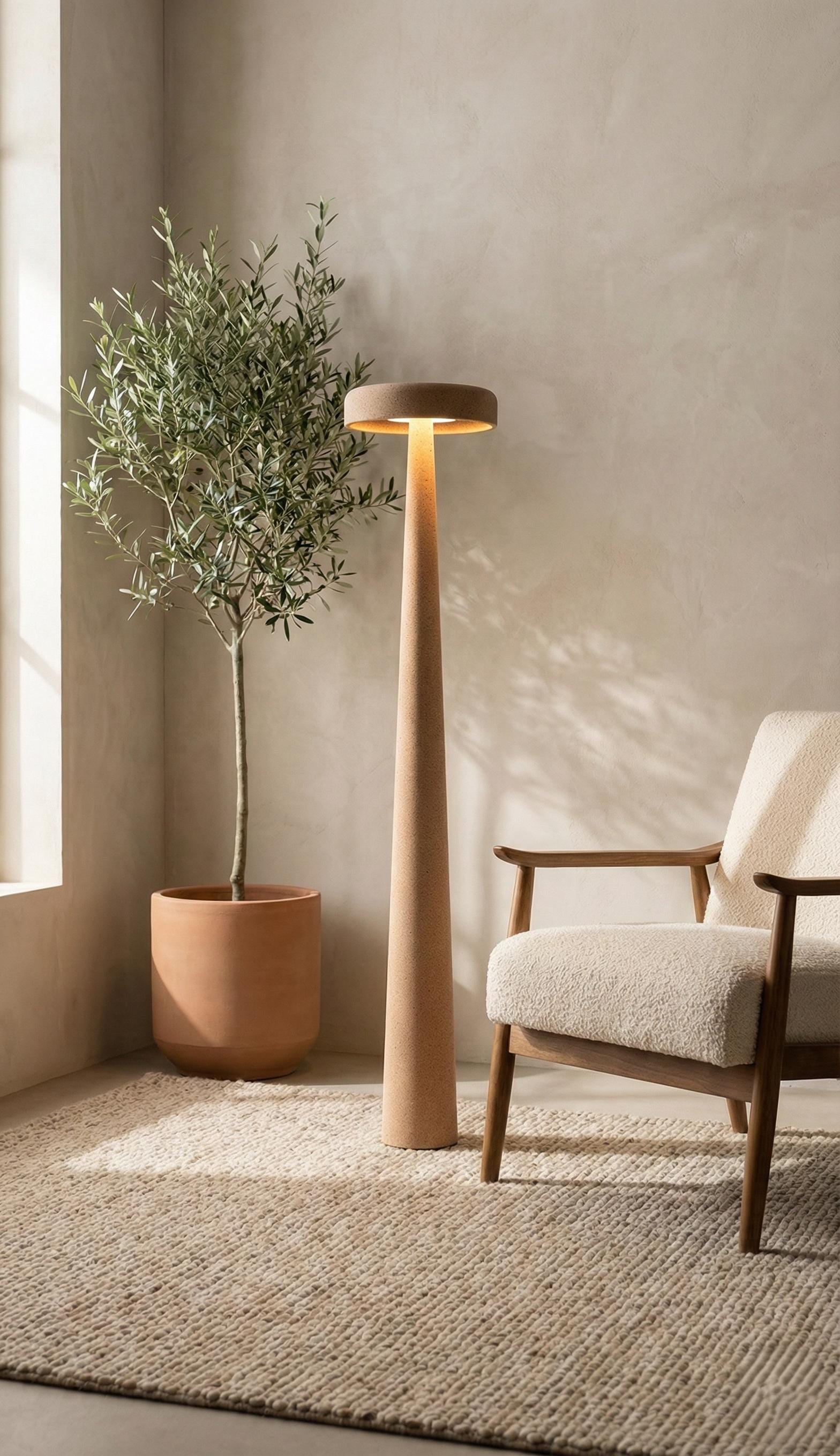
Neutral used to mean one thing: white walls, white trim, done. The new version of neutral is quieter but far more interesting — it's not about avoiding color, it's about choosing tone and texture over saturation.
A flat white wall and a hand-textured plaster surface in the exact same shade of white will never look the same. One is a backdrop. The other has depth, grain, and shadow built in — it changes the definition of "neutral" from blank to layered.
Texture Is the New Accent Color
Instead of reaching for a bold accent wall, the more current move is to introduce a single richly textured object in an otherwise calm palette. It does the same job — giving the eye a focal point — without breaking the room's quiet.

A neutral palette isn't the absence of a decision. It's a decision to let texture do the work color used to do.
When You Do Want Color, Choose It Deliberately
Some pieces are made to order in custom tones — a muted RAL color instead of raw plaster — so a single lamp can shift from warm sand to soft charcoal depending on the room it needs to sit in.


Neutral doesn't have to mean flat. It just means the color decisions are quiet enough that texture gets to lead.
Browse the full collection of handmade sculptural decor on monoaurel.com and find the piece that anchors your space.